DocsFrontend
Storyboard
The admin’s component workshop, like Storybook: docs, a playground at every screen size, tests and design review for the kit’s components and your own.
The Storyboard works like Storybook. Every component with stories gets a docs page, a playground and its tests: the kit’s, and your app’s own.
The Storyboard is a commercial plugin. It comes with a business licence, on every server it covers. It isn't part of the free, non-commercial Sluurp, but it can be bought on its own as well.
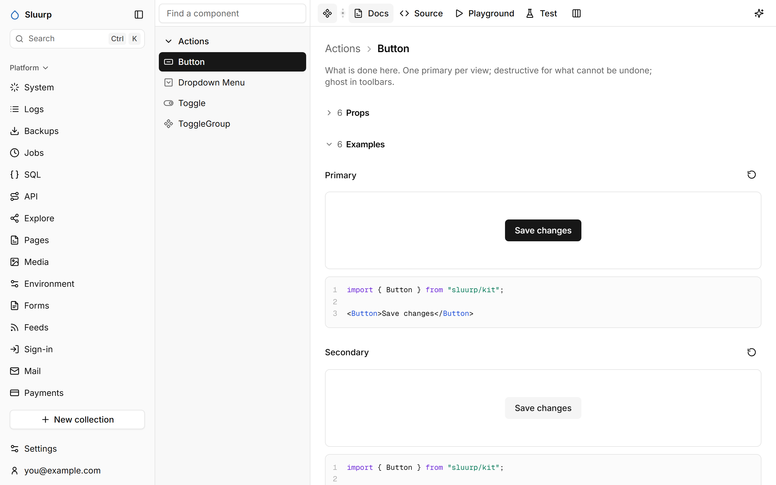
Features include:
- Stories in Storybook’s Component Story Format, so the same files work in both
- A playground at every screen size, with controls, code and a design review
- Plays that use a component as a person would, recorded as you click and type
- An agent that makes and changes components, and tests them before it’s done
- Export of a story as a web component
Stories
Any *.stories.tsx in your app shows up, under Custom. Stories use Storybook’s Component Story Format:
import { GradientButton } from "./gradient-button.tsx";

export default {
  title: "Buttons/Gradient Button",
  component: GradientButton,
  args: { children: "Book the trip" },
};

export const Sunset = {};
export const Ocean = { args: { tone: "ocean" } };
Playground
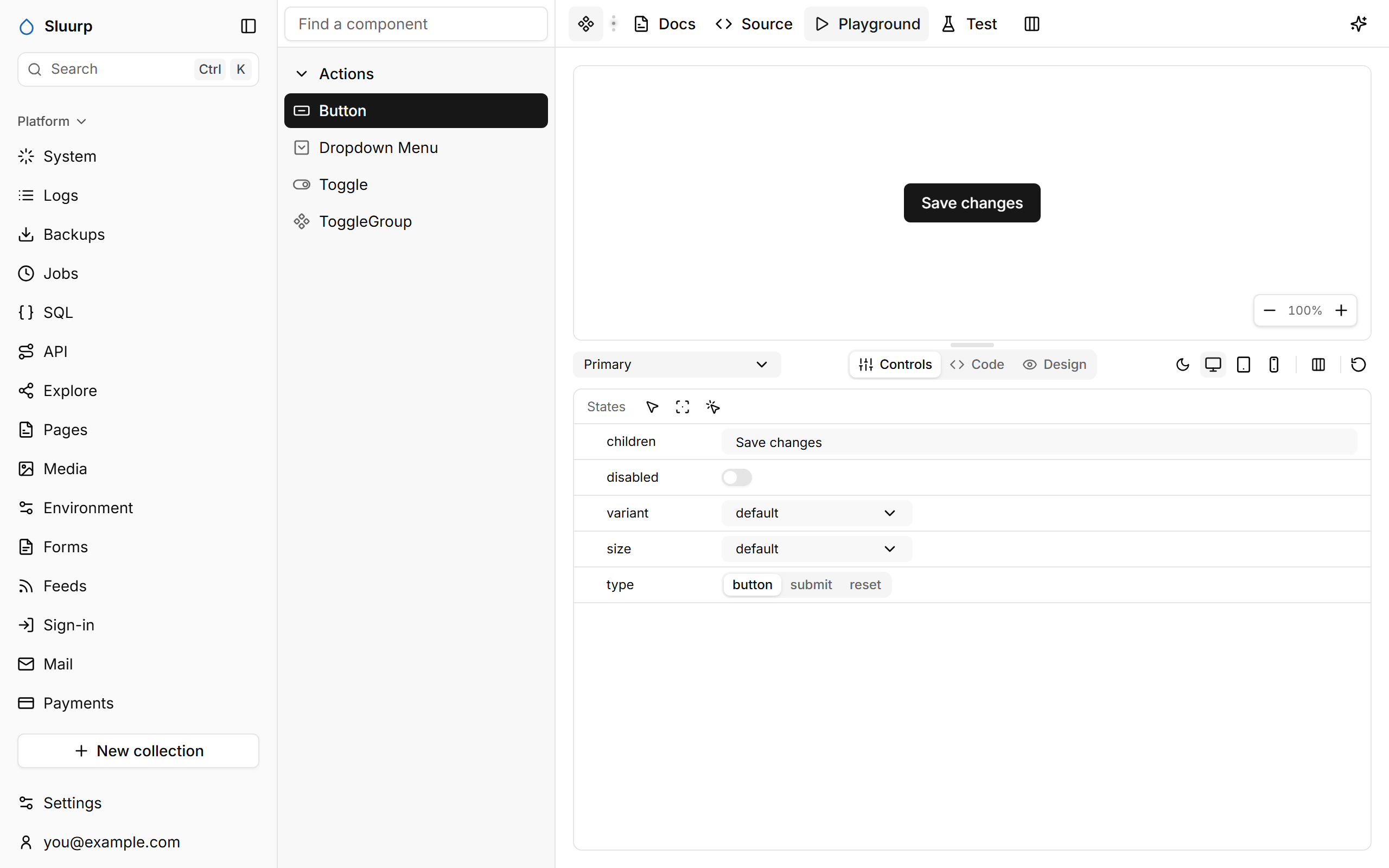
One story at full width, tablet or phone, or all your devices side by side. Controls edits its props, Code shows it, Design reviews it: contrast, type sizes, alignment, touch targets.
Test
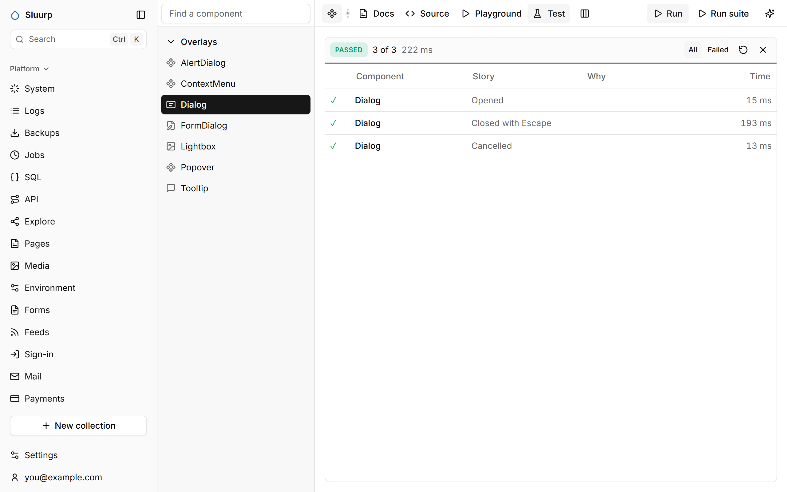
A story’s play uses the component as a person would. Run runs the component’s plays, Run suite runs every story’s. Record writes a play while you click and type.
import { expect, userEvent, within } from "sluurp/test";

export const Cancelled = {
  play: async ({ canvasElement }) => {
    const canvas = within(canvasElement);
    await userEvent.click(await canvas.findByRole("button", { name: "Open the dialog" }));
    await userEvent.click(await canvas.findByRole("button", { name: "Cancel" }));
  },
};
The agent
The sparkle in the header opens an agent that makes and changes components: it reuses the kit, shows the result in the Playground, and runs the tests and the design review before it’s done.
Where a play failed
When a play fails in one of your own story files, Tests shows the file and the line it failed on, with the lines around it. Show in Source opens the Source tab with that line selected, ready to fix.